
The bullish engulfing candle is one of the easiest reversal patterns to recognise on a trading chart. A relatively small red candle is followed by a larger green candle, suggesting that buyers have swept in and overwhelmed the previous session’s selling pressure.
It certainly looks convincing. But how reliable is a bullish engulfing candle in practice?
The honest answer is that it can be a useful signal, but it is not reliable enough to trade blindly. Its effectiveness depends heavily on where it appears, the market conditions surrounding it and whether other forms of confirmation support the move.
In this guide, we look at what the pattern means, how often it works and how traders can separate stronger bullish engulfing setups from those likely to fail.
What is a bullish engulfing candle?
A bullish engulfing pattern is a two-candle formation that usually appears after a price decline.
The first candle is bearish, meaning the price closes below its opening level. The second candle is bullish and has a real body large enough to engulf the body of the previous bearish candle.
In its traditional form:
- The market is already falling or pulling back.
- The first candle closes lower.
- The second candle opens at or below the previous close.
- Buyers take control and push the price above the first candle’s opening level.
It is the bodies of the candles that must be engulfed. The second candle does not necessarily have to exceed both the high and low of the previous candle, although a wider range may make the reversal look more forceful.
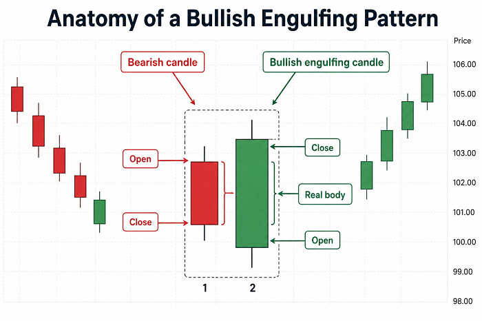 The pattern reflects a clear shift in short-term market sentiment. Sellers begin the sequence in control, but buyers respond strongly enough to recover the entire previous candle’s decline.
That does not automatically mean a new uptrend has started, however.
How reliable is a bullish engulfing candle?
There is no universal bullish engulfing candle success rate.
Any website claiming that the pattern is always, for example, 65% or 70% accurate should be treated cautiously. Results can vary considerably according to:
- The asset being traded
- The timeframe
- The definition of a successful trade
- The wider market trend
- Entry and exit rules
- Trading costs
- The confirmation filters applied
A 2025 study examined bullish engulfing patterns in five highly traded Indian large-cap stocks. Next-day win rates varied enormously, from 16% in one stock to 75% in another. However, none of the results achieved conventional statistical significance, and only one stock produced a positive five-day risk-adjusted return. The study therefore concluded that the pattern did not provide a reliable standalone edge within that sample.
The sample was relatively small, so this does not prove that bullish engulfing patterns never work. It does illustrate the danger of treating a recognisable candle formation as a complete trading system.
Other research into chart-image forecasting has similarly questioned whether named candlestick patterns add much predictive value when used without other market data. A 2025 study covering forex, stocks and cryptocurrencies found that adding detected candlestick patterns did not improve its model compared with analysing the broader chart image alone.
A sensible conclusion is therefore:
A bullish engulfing candle is best treated as an alert that buying pressure may be increasing, rather than proof that the market is about to rise.
Why market context matters
The location of the pattern is usually more important than the pattern itself.
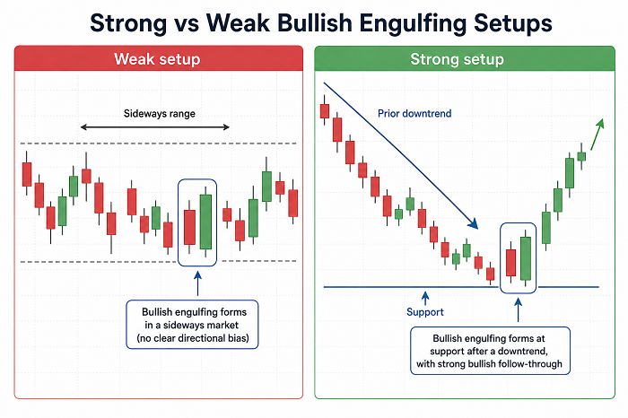
Imagine that a bullish engulfing candle appears in the middle of a narrow, sideways trading range. Buyers may have controlled that particular period, but they have not necessarily overcome any meaningful level or reversed an established trend.
Now imagine the same formation appearing after a sustained decline, precisely at a previous support level. The market falls into an area where buyers have stepped in before, briefly moves lower and then closes strongly above the previous candle’s open.
The second example has much more significance.
Trade Stocks and Forex has previously emphasised this principle when discussing bullish reversal bars: a reversal pattern should appear after a genuine downward move, rather than during an existing uptrend or an aimless period of consolidation.
Without a prior decline, there may be nothing meaningful to reverse.
What makes a bullish engulfing candle more reliable?
No single filter can guarantee a profitable outcome, but several factors can improve the quality of the setup.
A clear preceding downtrend
A proper bullish engulfing pattern should form after a decline.
That does not mean the market needs to have collapsed. It could appear after a pullback within a longer-term uptrend. What matters is that sellers have controlled the price action immediately before the formation.
Look for a sequence of lower highs, lower lows or several bearish candles leading into the pattern.
A random green candle inside a sideways range is much less meaningful.
A recognised support level
Bullish engulfing patterns tend to be more interesting when they coincide with an area where demand might reasonably appear.
Relevant areas can include:
- A previous swing low
- Horizontal support
- A rising trend line
- A major moving average
- A Fibonacci retracement level
- The lower edge of a trading channel
The level provides the trading idea; the candle provides evidence that buyers may be responding to it.
A pattern appearing at an arbitrary point on the chart lacks this additional reasoning.
Strong volume
In markets where dependable volume information is available, increased activity can add credibility to the move.
A large bullish candle formed on weak volume may simply indicate that sellers temporarily stepped back. A similar candle formed with unusually high volume suggests that more traders participated in the reversal.
Volume is not perfect confirmation. News, futures contract expiry and other events can distort the figures. Nevertheless, a reversal accompanied by increasing participation is generally more persuasive than one taking place in quiet trading.
Forex traders should remember that spot forex does not have a single central exchange recording total market volume. Tick volume can still be useful, but it is not identical to centralised share-market volume.
A decisive closing price
Where the second candle closes can reveal a great deal about the balance between buyers and sellers.
A strong engulfing candle will usually close near its high, showing that buyers remained in control until the end of the period.
A long upper wick tells a less encouraging story. Buyers drove the price higher, but sellers returned before the close and forced it back down.
The candle may technically engulf the previous body, but its closing strength is weaker.
Confirmation from the next candle
Waiting for another candle can reduce the risk of reacting to a one-period price spike.
Possible confirmation might include:
- A close above the engulfing candle’s high
- A higher high and higher low
- A successful retest of the engulfing candle
- A break above nearby resistance
- Continued buying on healthy volume
Waiting has a cost. The entry price may be less attractive and the required stop loss could become wider.
This is the familiar trade-off between entering early and waiting for greater confirmation.
Can RSI improve bullish engulfing reliability?
The Relative Strength Index is often used alongside bullish reversal patterns.
An engulfing candle appearing while RSI is deeply oversold may support the idea that selling has become stretched. Bullish divergence can be particularly interesting: the price records a lower low while RSI makes a higher low, suggesting that downward momentum is weakening.
However, oversold does not mean that the market must immediately rise. Strong trends can remain oversold for much longer than expected.
RSI should therefore support the price-action setup rather than replace it. A poor engulfing pattern does not suddenly become a high-quality trade simply because RSI has fallen below 30.
Bullish engulfing candles on different timeframes
The pattern can appear on almost any chart, from a one-minute forex chart to a weekly share chart.
Generally, patterns on higher timeframes contain more information.
A daily engulfing candle represents an entire trading session. A weekly candle summarises five days of changing expectations, news and order flow. By comparison, a five-minute formation may result from temporary volatility or a handful of large orders.
This does not mean lower-timeframe patterns are useless. Intraday traders can use them effectively, but they must account for:
- Wider spreads during quiet periods
- Market-opening volatility
- Economic announcements
- False breakouts
- Short-term liquidity effects
A bullish engulfing candle formed during an important support retest on a four-hour chart will normally deserve more attention than one appearing randomly on a one-minute chart.
How to trade a bullish engulfing pattern
One approach is to enter when the engulfing candle closes. This secures an earlier price but provides less confirmation.
A more cautious trader may wait for the price to break above the engulfing candle’s high. Another option is to wait for a small pullback towards the candle’s midpoint, although the market may continue rising without offering an entry.
A stop loss is commonly placed below the lowest point of the two-candle formation. That creates a logical invalidation level: if the price falls below the area from which buyers supposedly took control, the reversal argument has weakened.
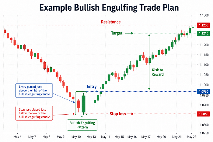
The next resistance area can provide a potential profit target. Before entering, compare the distance to the stop with the available upside.
A pattern may look excellent but still offer a poor trade if resistance is directly overhead. Winning more often is not enough if losing trades are considerably larger than profitable ones.
Common reasons bullish engulfing patterns fail
Even textbook formations can fail, particularly when traders ignore the wider chart.
Common problems include:
Entering directly below resistance
A strong green candle may run straight into a previous swing high or major moving average. Buyers then have little room to continue before encountering fresh selling.
Mistaking consolidation for a downtrend
Alternating red and green candles inside a range can produce numerous engulfing formations. Most are simply noise rather than genuine reversals.
Chasing an oversized candle
A very large engulfing candle looks powerful, but entering near its close can require a distant stop. Much of the immediate move may already have taken place.
Ignoring important news
A candle created by an interest-rate decision, earnings announcement or economic release may be extremely volatile. The initial reversal can disappear just as quickly as it formed.
Treating the pattern as certainty
Every trading setup can lose. Increasing position size because a candle appears “perfect” can turn an ordinary false signal into a damaging loss.
Bullish engulfing candle reliability: the verdict
The bullish engulfing candle is a useful way of identifying a sudden shift from selling pressure to buying pressure. It is visually clear, easy to recognise and applicable to forex, shares, indices, commodities and cryptocurrency charts.
But the candle itself is not a reliable trading system.
Recent evidence suggests that its standalone performance can vary widely between assets and may not produce a statistically dependable edge. Its real value comes from combining the pattern with context.
The strongest setups generally appear after a genuine decline, at a meaningful support area, with a decisive close and some form of momentum, volume or price-action confirmation.
Think of the pattern as a piece of evidence rather than the final verdict. When several independent factors point towards the same conclusion, a bullish engulfing candle can become a valuable addition to a disciplined trading strategy. When it appears alone in the middle of nowhere, it may be little more than an attractive shape on a chart.
Leave a Reply